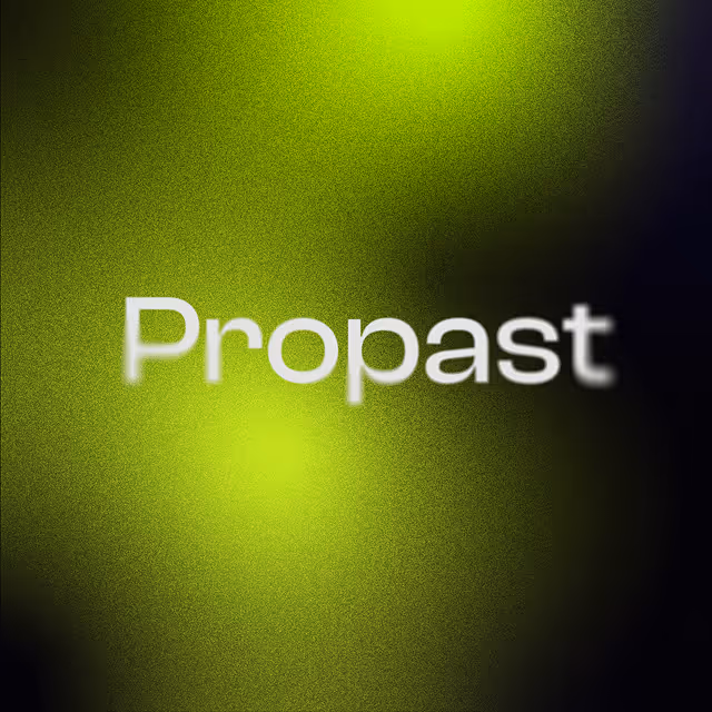
Propast studio
The challenge
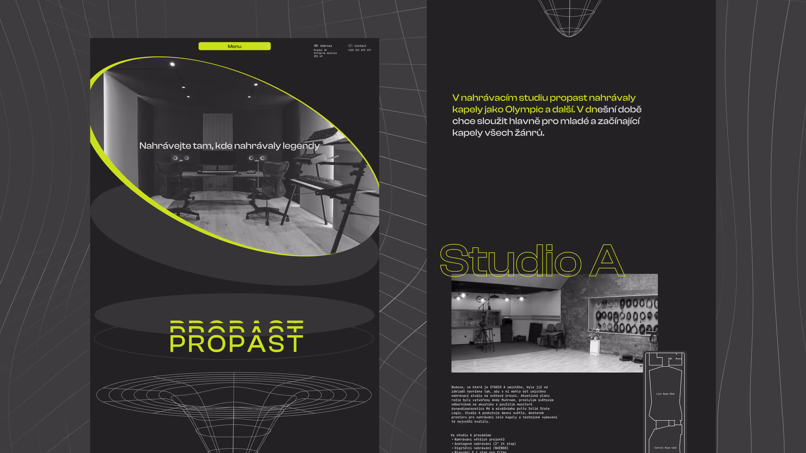
Studio Propast had built a strong reputation within the Czech music industry, but its digital presence no longer reflected the quality of its facilities or the atmosphere musicians experience when recording there. The goal was to create a website that would feel as immersive and distinctive as the studio itself while making information easier to discover for potential clients.

Visual identity inspired by sound
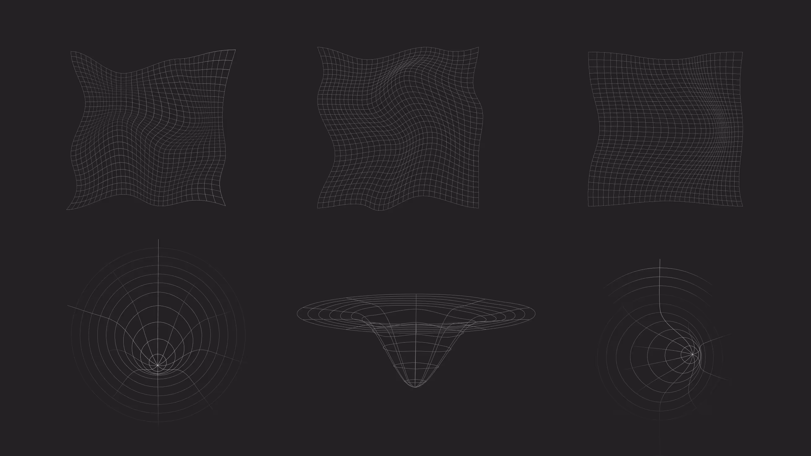
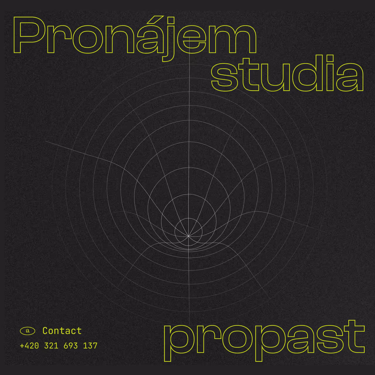
The new visual direction draws inspiration from sound waves, acoustic resonance, and the physical spaces where music is created. A combination of dark surfaces, wireframe graphics, and vibrant accent colors helps communicate both the technical precision and creative energy that define Studio Propast.
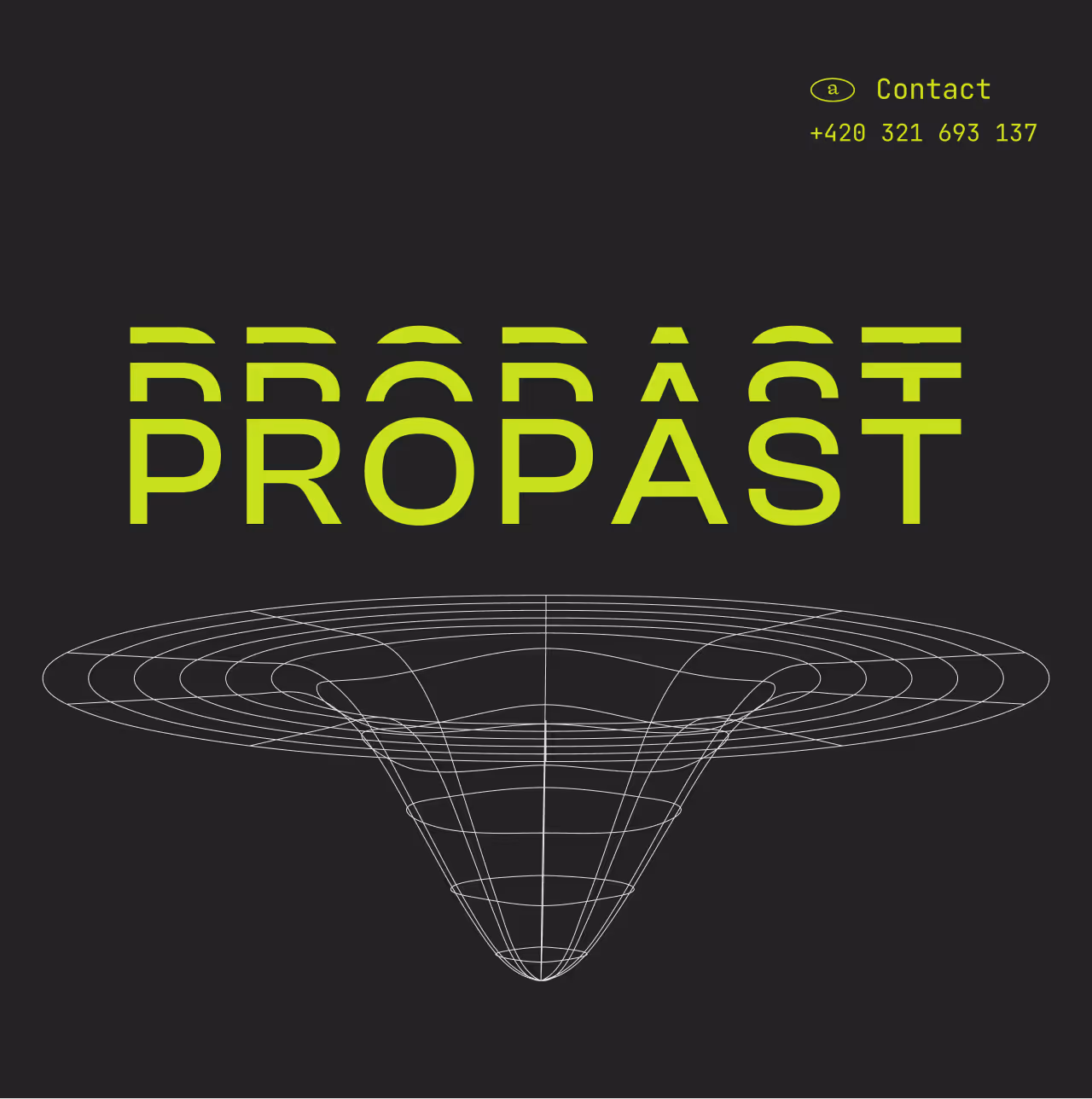
The name Propast is visually interpreted through a custom wireframe vortex inspired by the shape of an abyss, creating a distinctive brand element that symbolizes depth, focus, and immersion in sound.

Reaching a New Generation of Artists
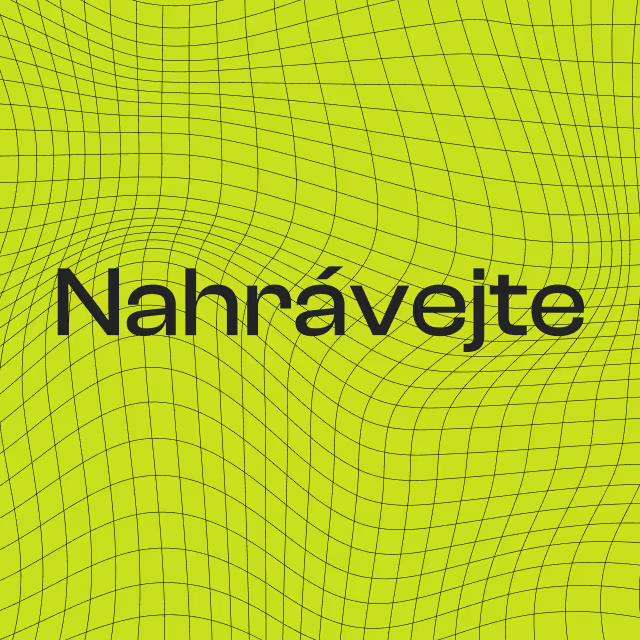
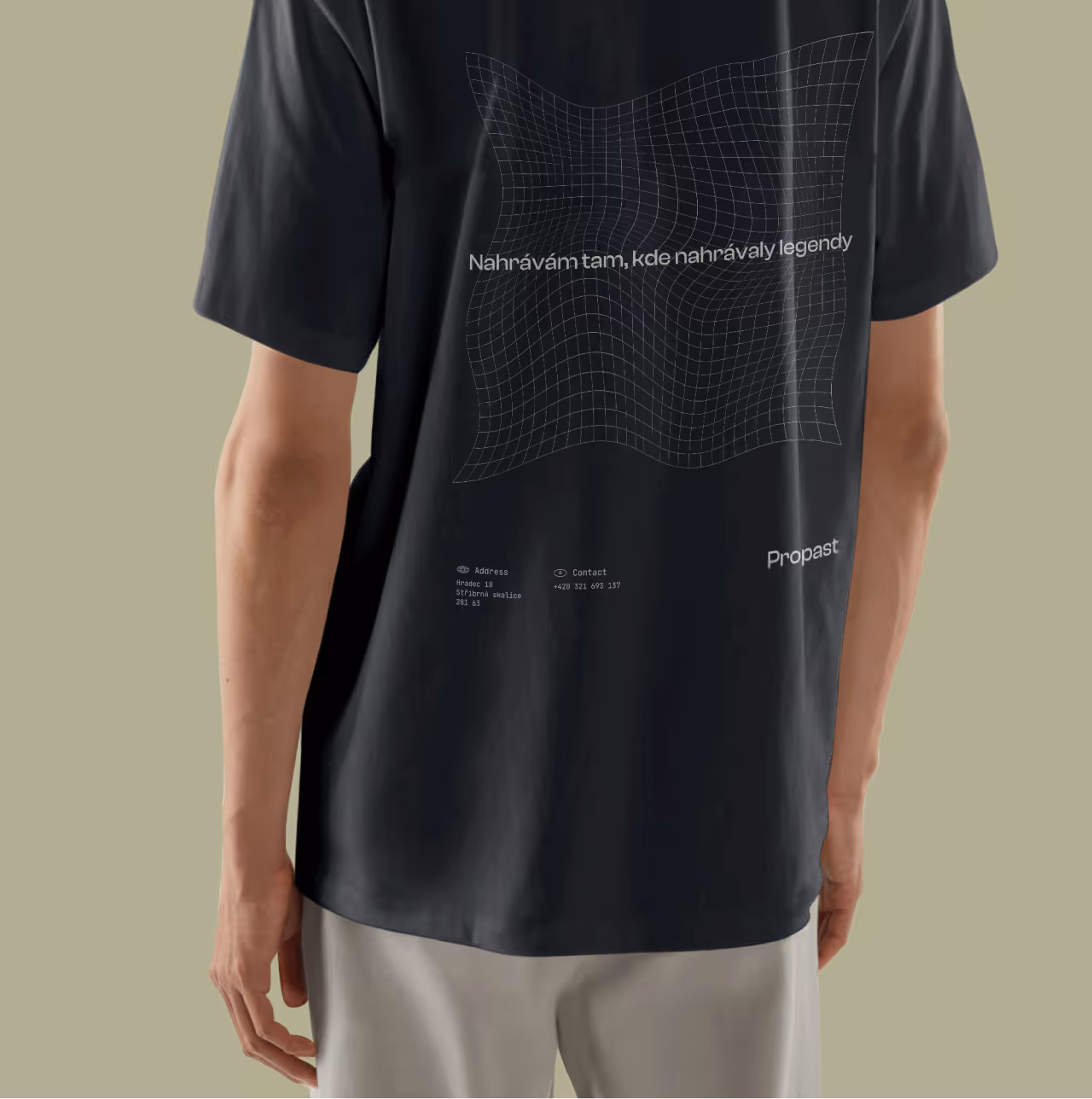
The concept aimed to make Studio Propast more appealing to younger musicians and emerging artists. Bright accent colors, experimental visuals, social media concepts, and merchandise ideas were introduced to create a stronger and more contemporary brand presence.
As this was an internal project, the concept was never fully developed into a coded website and remained at the design exploration stage.