IPR Praha
Intro
The Institute of Planning and Development of Prague (IPR Prague) is the city’s main conceptual and strategic organization responsible for urban planning, architecture, development policies, and spatial data management. It serves both the general public and professional stakeholders involved in shaping the future of Prague.
The goal of this project was to evaluate the usability and effectiveness of the newly launched IPR Prague website. We aimed to understand how different user groups — both the general public and professionals — navigate the site and access key information. Based on qualitative research and quantitative data, the objective was to identify areas for improvement and validate design decisions.
The Challenge
After Visualio agency and web designer Kateřina Roznerová designed and launched the new IPR Prague website, the next critical step was to validate its real-world usability and accessibility. As a public institution serving both citizens and urban planning professionals, IPR provides complex regulatory documents, planning data, and project information that must be clearly structured and easily navigable across very different user groups — including blind and partially sighted users.
Our role was to ensure that the redesigned structure truly supported orientation, search efficiency, and accessibility compliance in a high-stakes public context. If the website failed to provide clarity and equal access, the consequences could include reduced public trust, limited access to regulatory information, frustration among professionals, and potential accessibility compliance issues — all of which directly impact transparency and institutional credibility.
The research was conducted in collaboration with blind and partially sighted participants from the organization SONS. We also interviewed members of the general public, as well as professionals with architectural or related backgrounds who are — or could become — frequent users of the website.
Research Approach
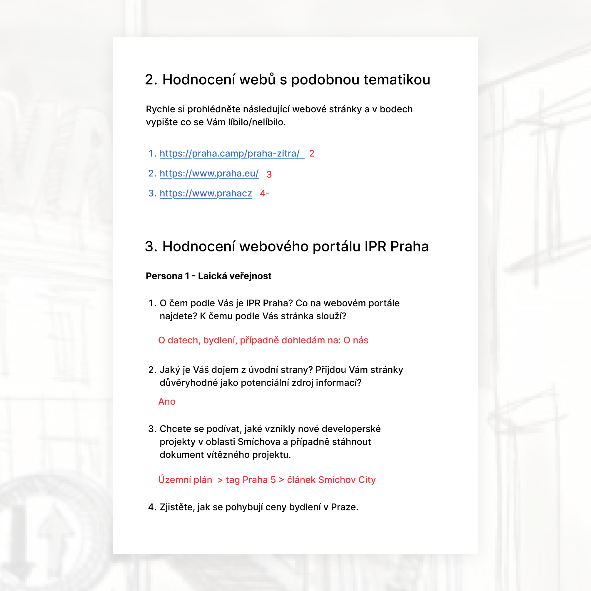
To validate the redesign, we combined qualitative and quantitative methods:
1. Moderated usability interviews
- 5 participants from the general public
- 5 industry professionals (architects, real estate stakeholders etc.)
Goal: evaluate orientation, information discovery, and perceived trustworthiness.
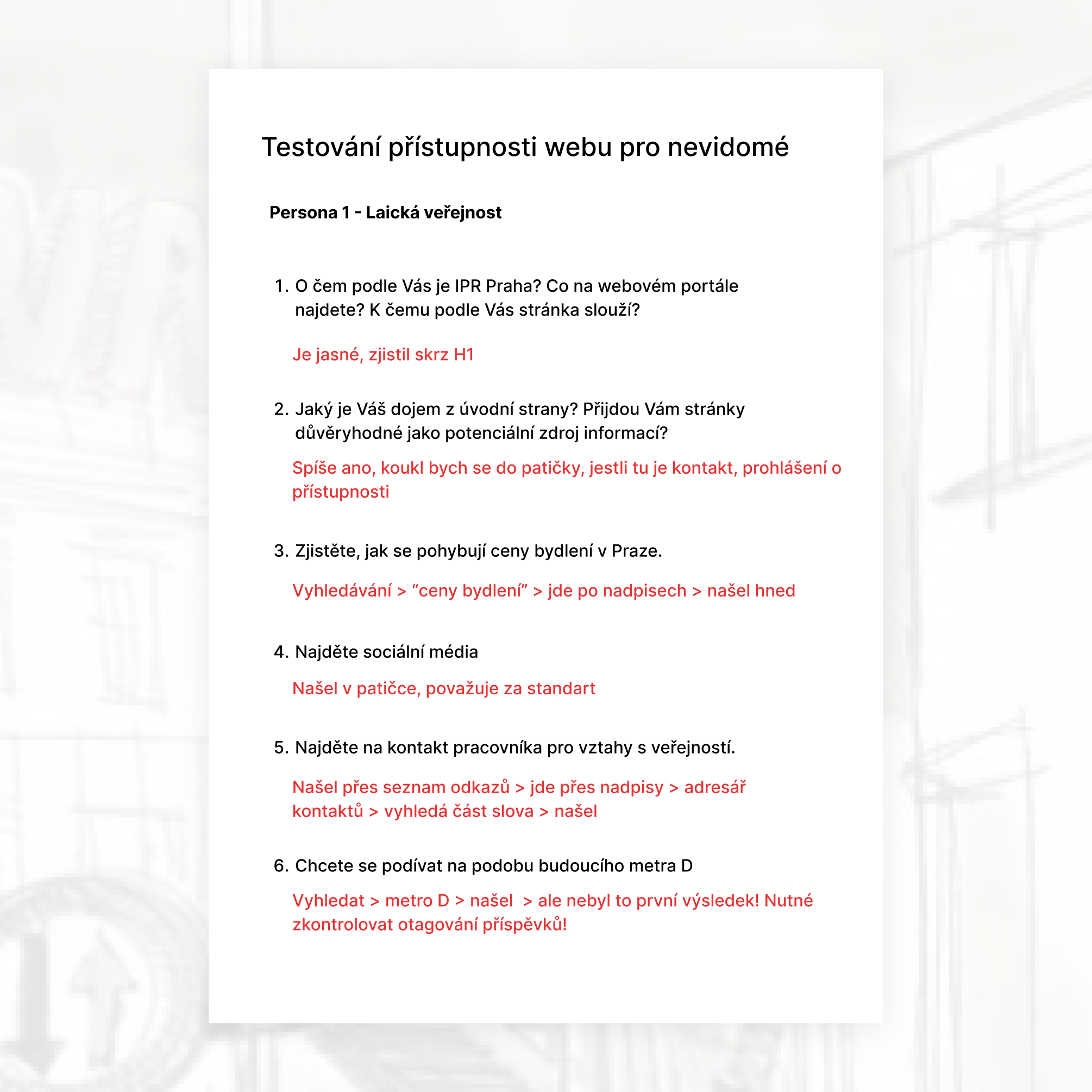
2. Accessibility testing (in collaboration with SONS)
- Blind and partially sighted users
- Real-time screen reader observation
Goal: evaluate semantic structure, ARIA implementation, and navigation clarity.
3. Behavioral analytics & A/B testing
- Google Analytics
- Google Tag Manager
- Smartlook (scroll depth, session recordings, heatmaps)
Goal: validate structural decisions and measure engagement impact.
Results of UX Testing for the General Public
Based on the results of the testing scenarios conducted with the general public, specific strengths and weaknesses of the website were identified.
Strengths
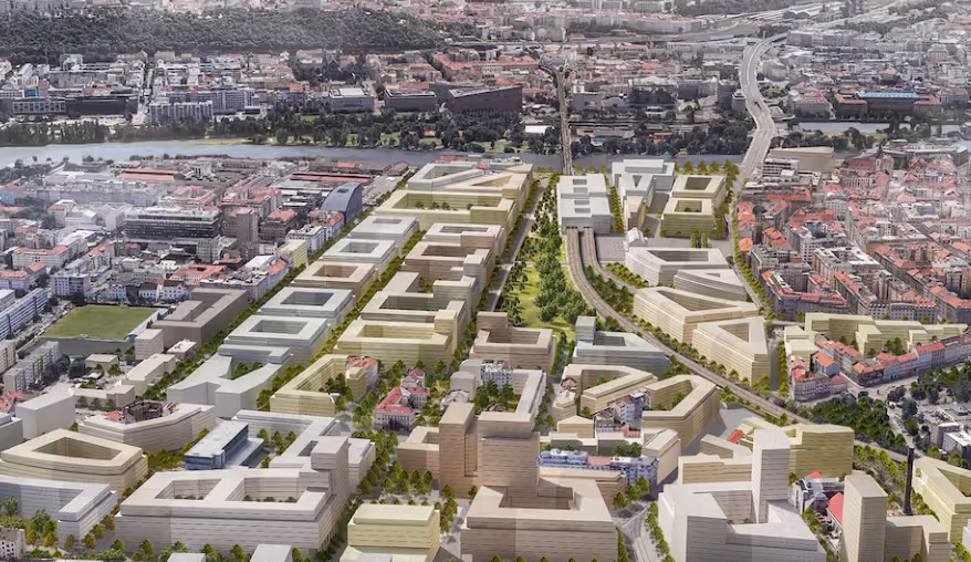
- Users considered access to information about new development projects in Prague highly valuable.
- The purpose of the website was clear at first glance.
- Younger and middle-aged participants had no difficulty finding information about projects.
- Housing market analyses and social media links were easy to locate.
- The website structure was perceived as clear and logical.
- The visual design was considered clean and professional.
- Most participants said they would recommend the website to others.
- Users responded positively to the tagging system.
Weaknesses
- Contact information was difficult to find, and most participants did not reach the contact directory section.
- Some tags were placed in locations that users found confusing (e.g., the "Metro D" tag on the Metro Písnice page).
Results of UX Testing for the Professional Audience
Based on the results of the testing scenarios conducted with the professional audience, specific strengths and weaknesses of the website were identified.
Strengths:
1. Key information such as building regulations, the zoning plan, the geoportal, and contact details was considered highly valuable.
2. The purpose of the website was clear at first glance.
3. Participants had no difficulty finding information related to building regulations and the zoning plan.
4. Social media links were easy to locate.
5. The website structure was perceived as clear and well organized.
6. The visual design was considered clean and professional.
7. Most participants said they would recommend the website to others.
8. The search functionality was viewed as an important and useful feature.
Weaknesses:
1. Although most respondents were able to find contact information, they expected contacts to be accessible directly from the primary navigation level.

Results of UX Testing for Blind and Partially Sighted Users
Based on usability testing sessions conducted with blind and partially sighted participants, several strengths and weaknesses of the website were identified.
Strengths
- The purpose of the website was clear at first glance.
- The website was perceived as trustworthy and reliable.
- Social media links were easy to locate.
- Contact information was relatively accessible. Although participants did not find the full contact directory, they were able to access media contacts or the "I Have a Question" section.
- Most participants said they would recommend the website to others.
- The technical accessibility implementation, including ARIA attributes and semantic heading structure, was generally evaluated positively.
- Project visualizations were well received.
Weaknesses
- Some image descriptions (alt texts) were perceived as overly detailed or repetitive.
- Certain navigation labels contained duplicated text, resulting in a frustrating experience for screen reader users, as the same content was announced multiple times.


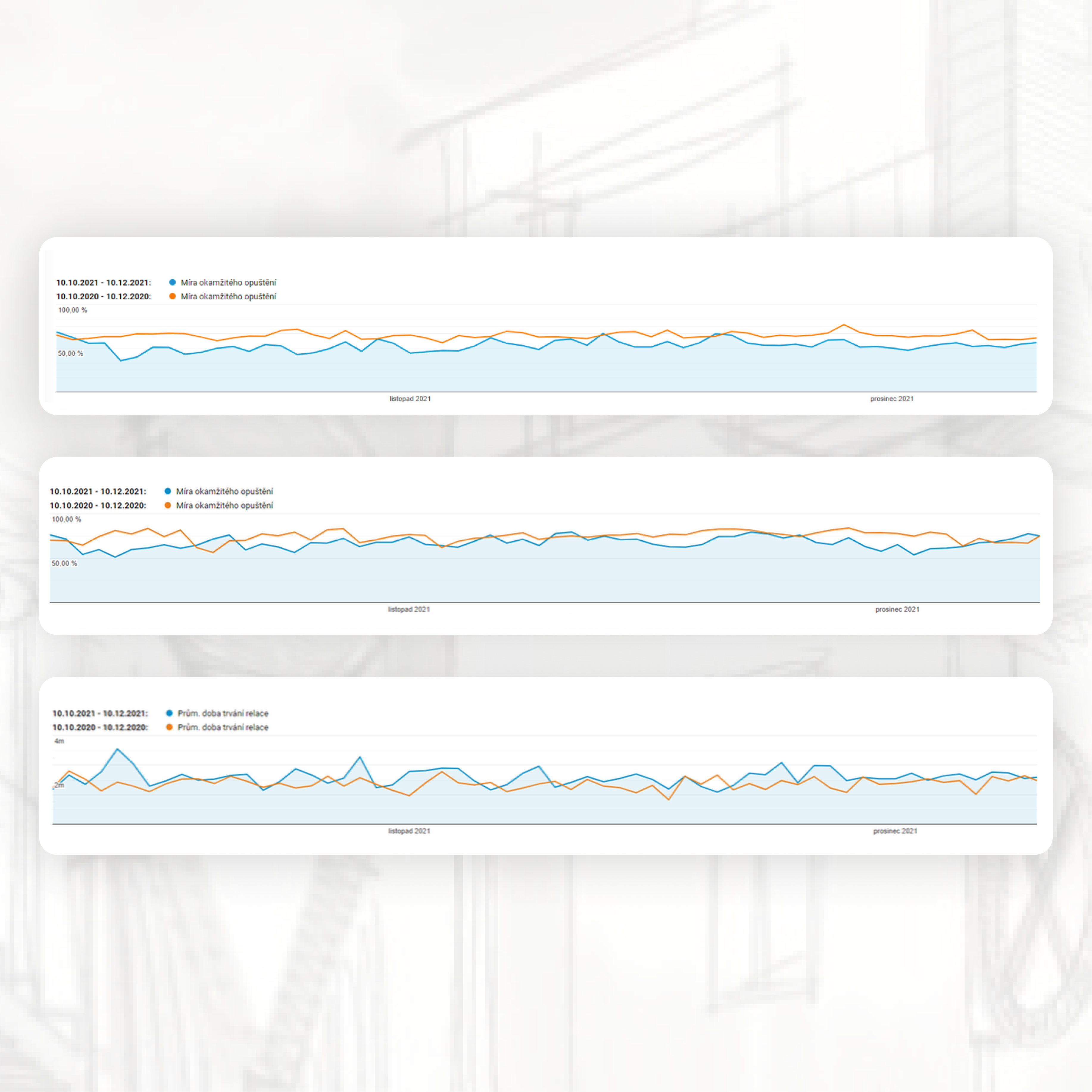
A few examples of our A/B tests
For the A/B measurement, several testing scenarios were created using Google Analytics, Google Tag Manager, Google Optimize, and the Smartlook platform.
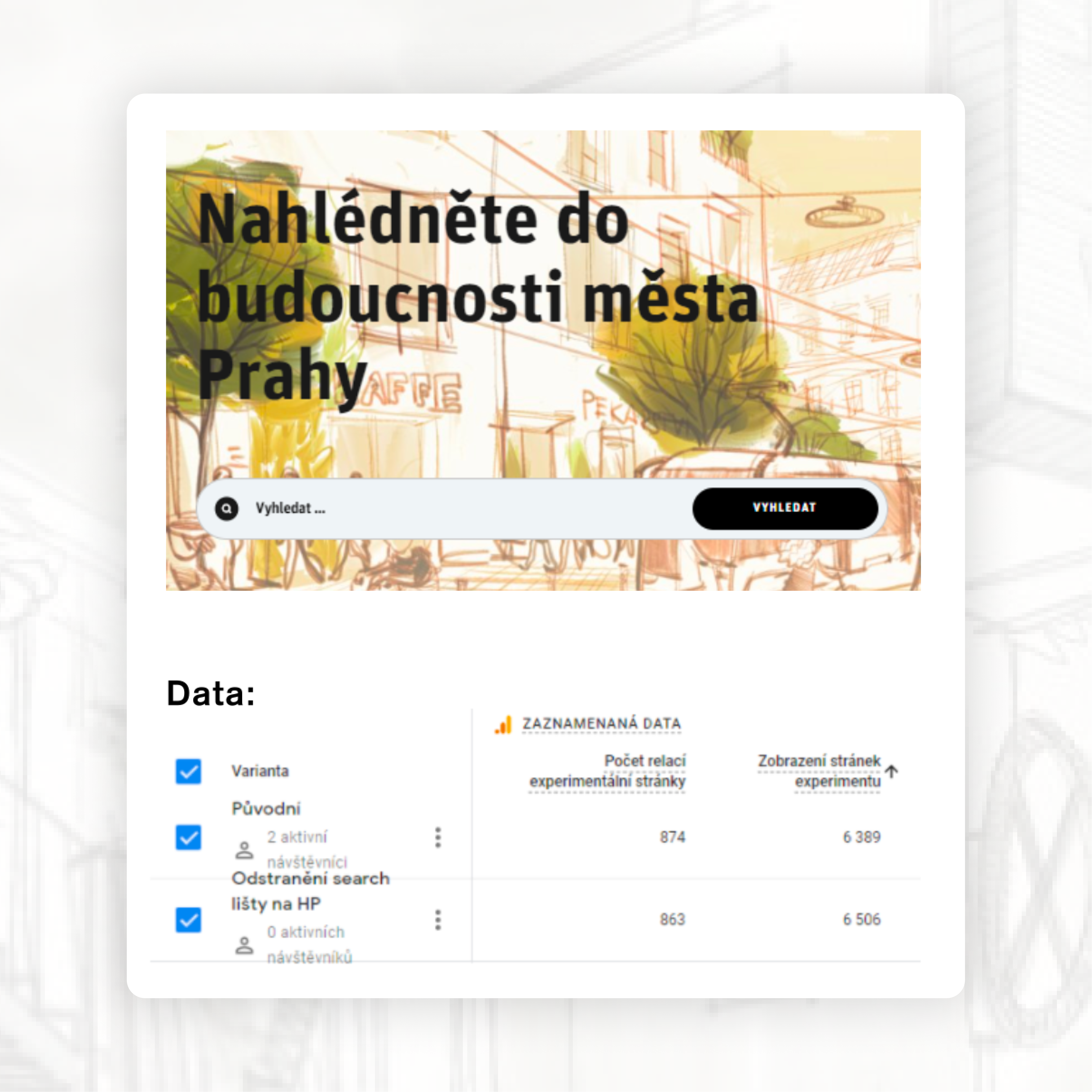
1. Search Bar Usability on the Homepage
After removing the search field from the homepage, the total number of page views increased. This may indicate that the search bar helps users find the desired content more quickly, resulting in fewer page transitions.
Based on this outcome, the decision was made to keep the search bar on the homepage.
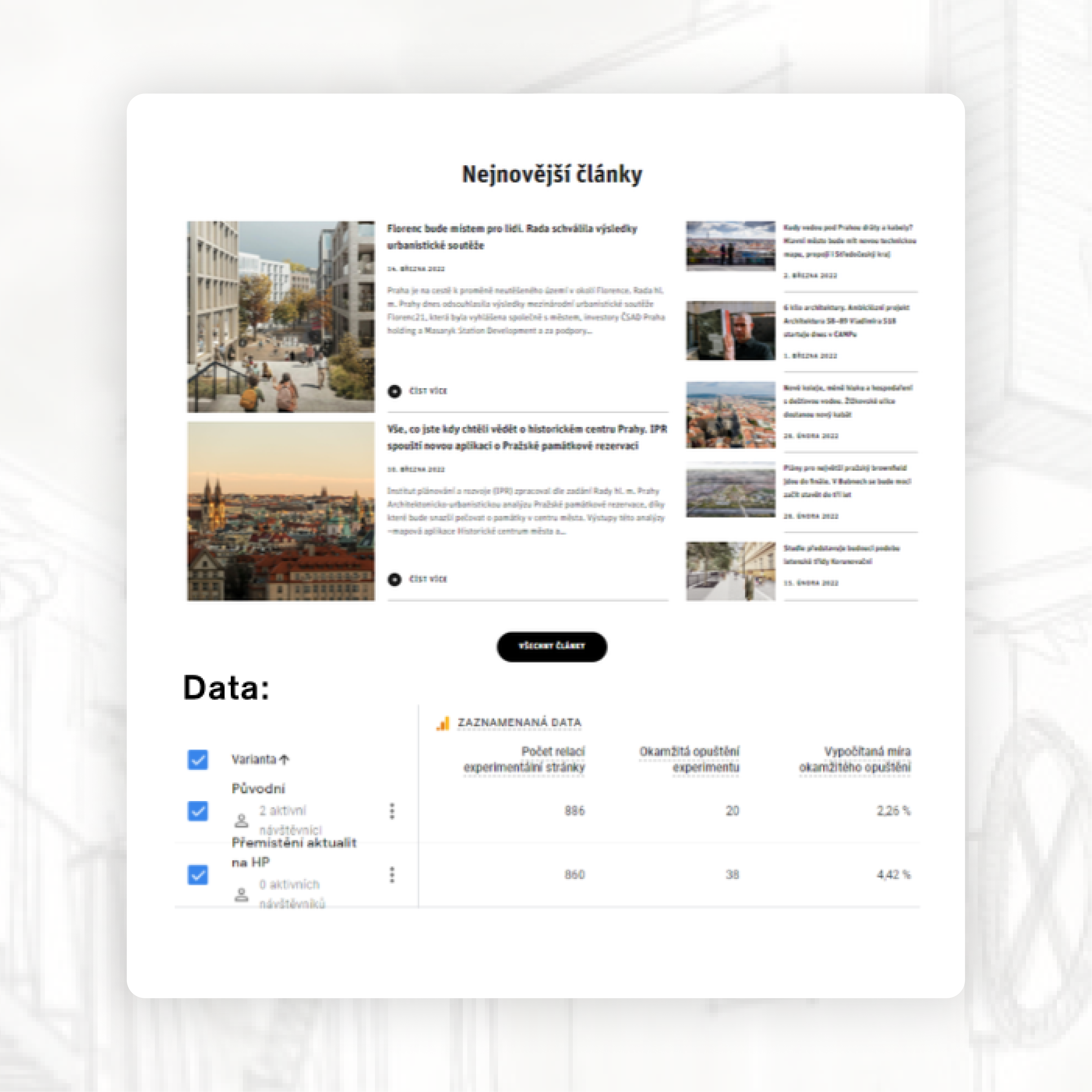
2. Relocating News Content to the Bottom of the Homepage
Our hypothesis was that keeping the news section at the top would reduce bounce rate, as recent updates represent engaging and dynamic content that may encourage users to continue exploring the site.
When the news section was moved to the bottom of the homepage, the bounce rate increased.
Based on this outcome, the decision was made to keep the news section in its original position.
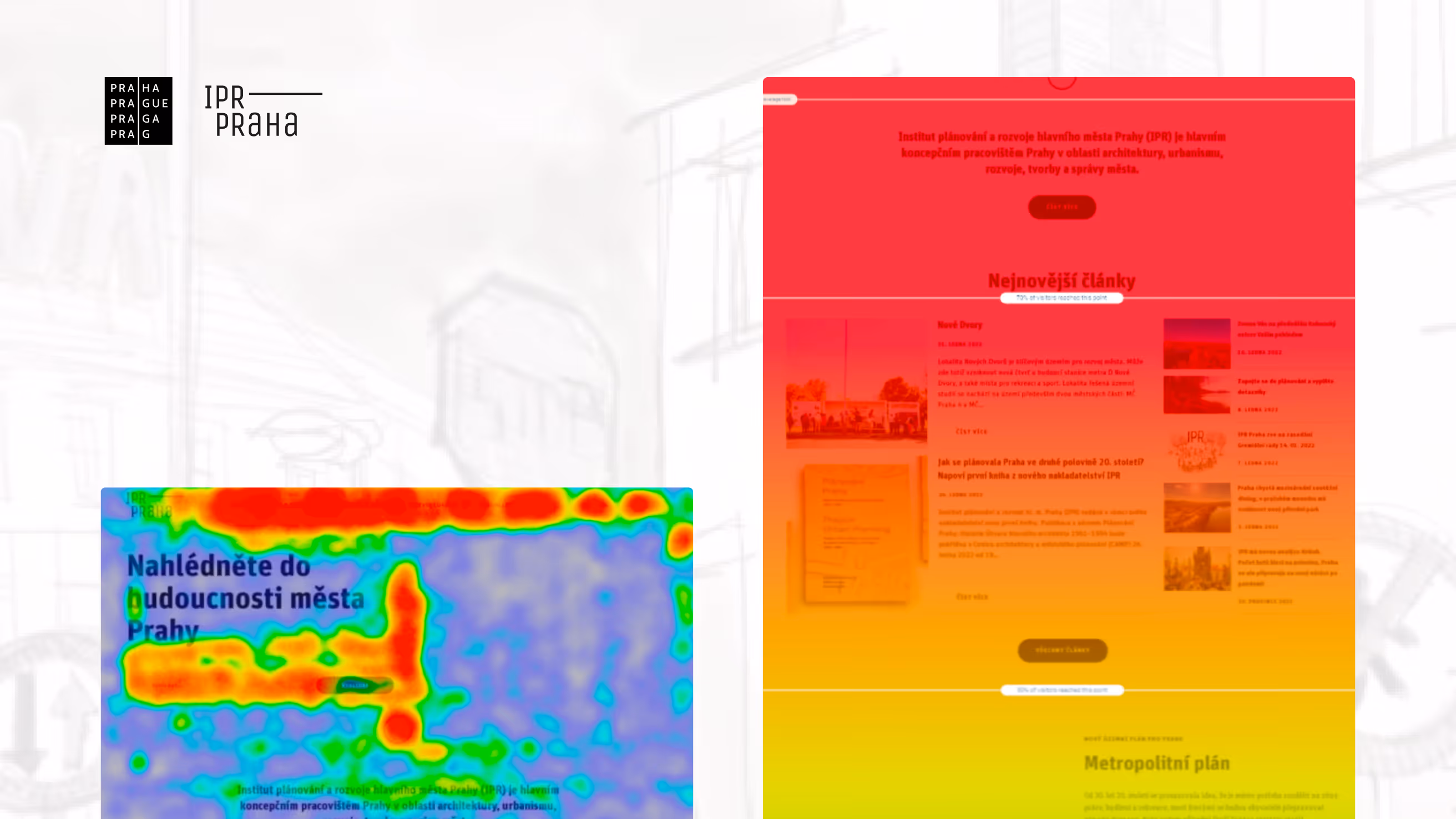
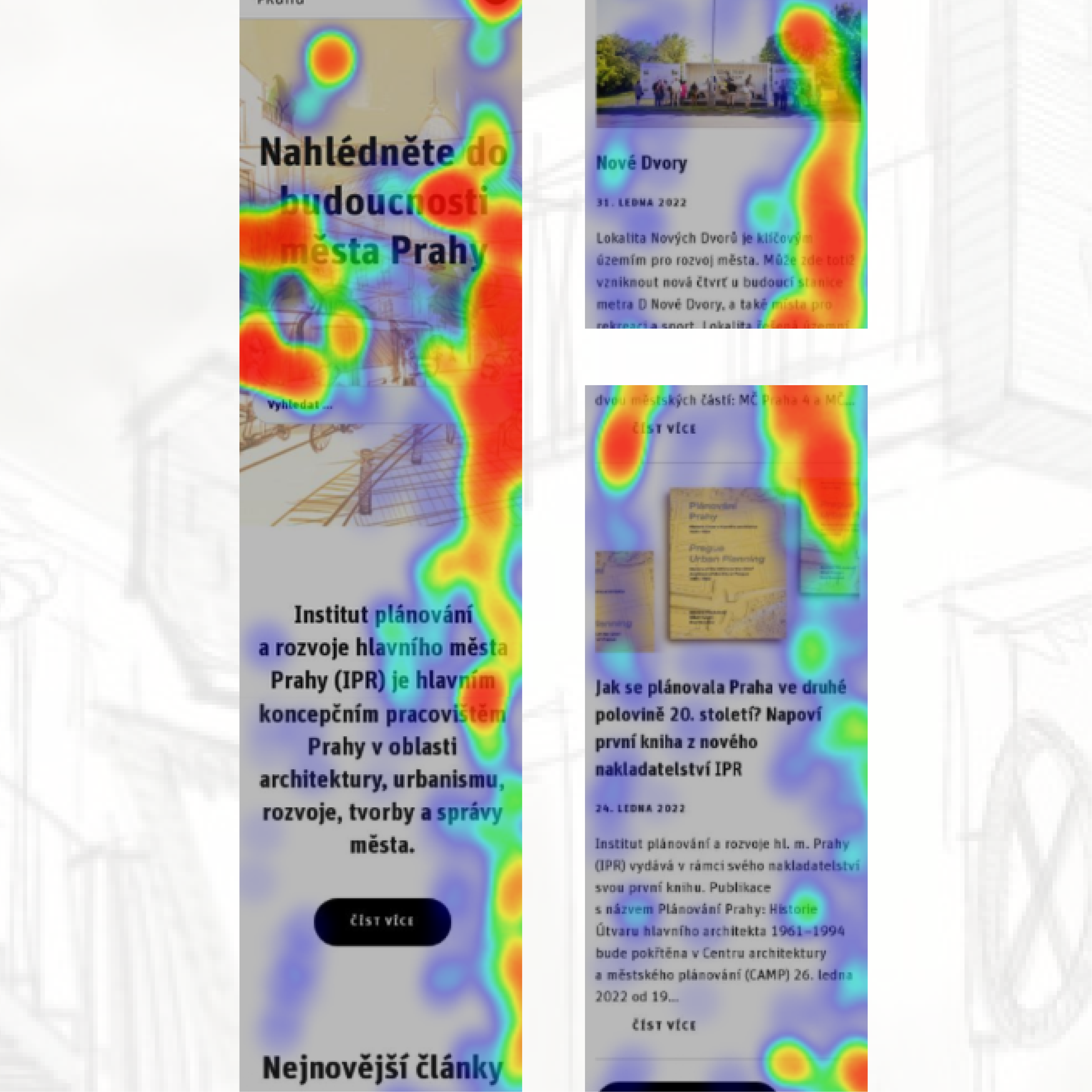
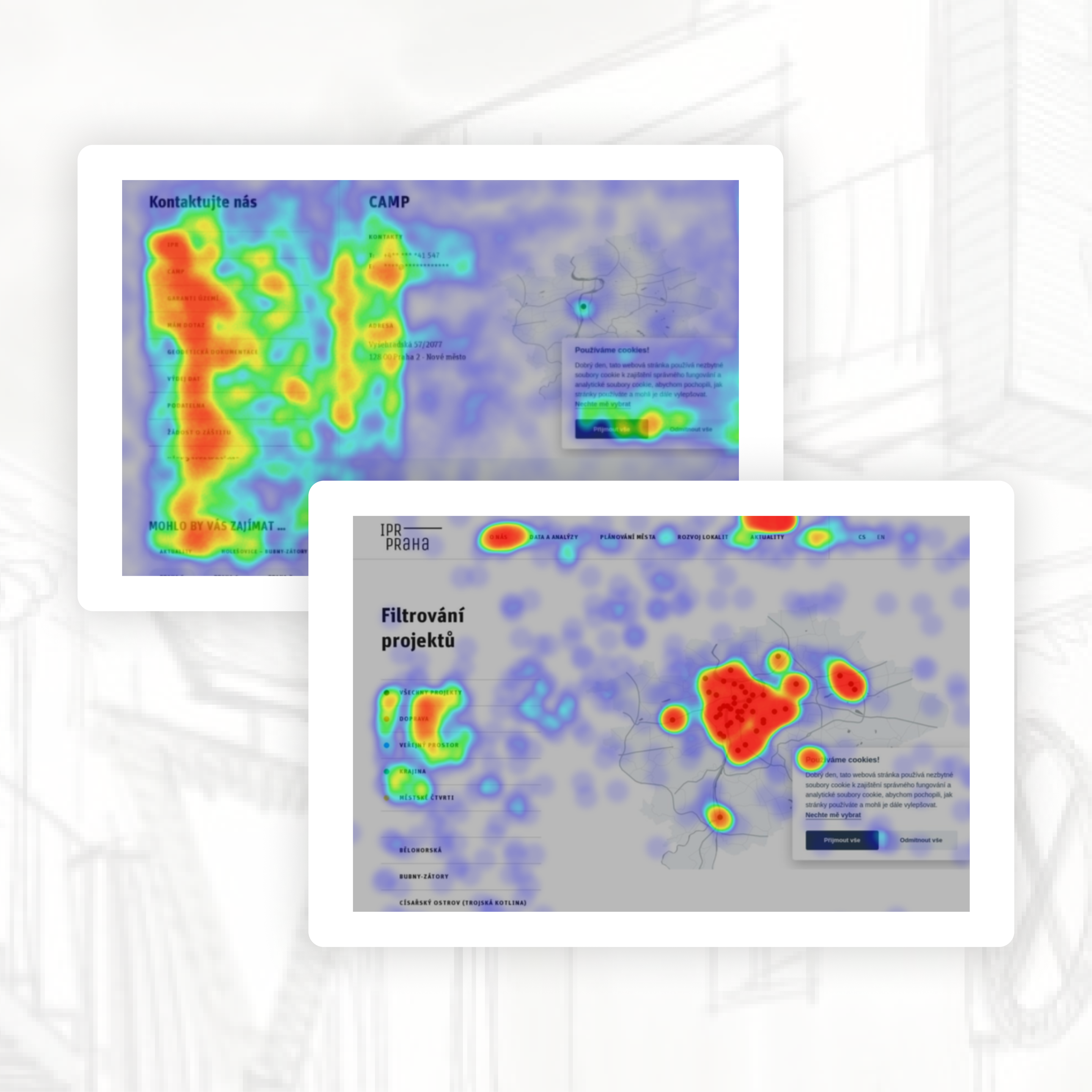
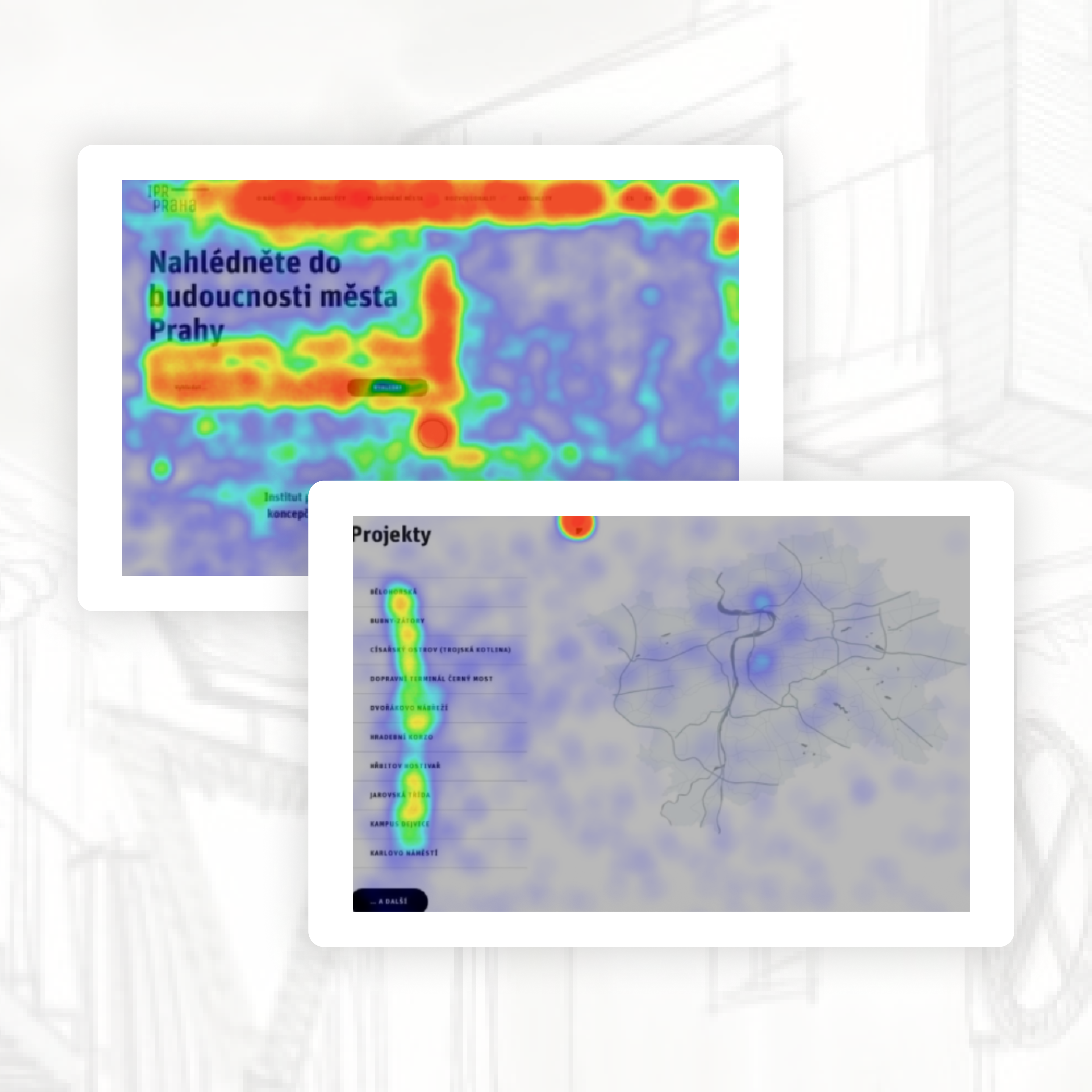
Key Findings from Heatmap Analysis
Heatmap data confirmed that search is one of the most frequently used elements on the website, making it a critical part of the homepage experience. Users also interacted heavily with contact-related content, highlighting the need for more visible and accessible contact information.
The project map received significant attention despite its lower placement on the page, suggesting that users actively rely on it and that it could benefit from a more prominent position.
Final Outcomes of Testing
What We Recommend to Improve:
Based on interviews with general users, professionals, and visually impaired participants, we implemented structural and accessibility refinements:
Navigation & Search:
- Moved Contacts to the main navigation.
- Improved search result relevance.
- Clarified the difference between tags and actual search results.
- Increased visibility of application titles on key pages.
Accessibility:
- Improved ARIA labeling for collapsible menus.
- Added structural support for nested navigation.
- Removed repetitive phrases that caused screen reader friction.
- Refined alt texts to remove non-informative descriptions.
- Updated the homepage title for clarity.
These changes improved orientation, reduced friction, and strengthened accessibility compliance.
What We Validated (and Kept):
Through A/B testing, we confirmed that several core design decisions were already optimal:
- The dual search presence on the homepage was retained.
- Black map markers remained unchanged.
- The news section stayed at the top of the homepage.
- The gallery placement on project detail pages remained unchanged.
Data showed that altering these elements did not improve engagement or conversion metrics.